Check a diagram against its real outage history
Before you start: A saved diagram of the system, and a log of its blocks' outages: which block, when it went down, when it came back.
A reliability block diagram predicts. An outage log records what actually happened. Putting the two side by side answers the questions people ask after a year in service: how available was the plant really, which equipment cost us the most downtime, and were the failure and repair figures in the model any good?
The Outage history tab does this. You give it a log of each block's outages. It merges them through the diagram's structure, so it knows that a pump going down while its partner ran didn't stop the system, but the controller going down did. Every system outage is traced to the block that caused it.
It works for any diagram, repairable or not, and uses the diagram as last saved.
What your log needs
One row per outage, in a CSV file or pasted text:
asset,down,back up,reason,planned
Pump A,2025-01-14 08:00,2025-01-14 19:30,seal leak,no
Controller,2025-02-03 02:10,2025-02-03 09:40,PLC card,no
Pump B,2025-03-02 06:00,2025-03-02 14:00,service,yes
- Asset: the block it belongs to, by its name in the diagram (or its id). Required.
- Down: when the outage started. Required.
- Back up: when it ended. A blank cell means it's still down. Or give a Duration column instead.
- Reason and Planned are optional. Mark planned maintenance outages yes, so they're counted apart from failures.
Times can be dates (ISO, or day/month/year) or plain numbers. Dates are converted into the diagram's unit; plain numbers are read as times in it.
Import the log
Open the diagram and choose the Outage history tab. The log is kept with a saved diagram, so save a new one first. A shared sample can't hold a log: the tab offers Save a copy to make it yours.
Paste the log, or Choose a CSV file…, then press Read columns. Reliafy guesses which column is which from the headers and shows the guess; change any that are wrong. Below the columns are four settings:
- Window start and Window end: the period the log covers. Left blank, it runs from the first outage to the last record. Set them to the real period, such as a whole year, or the quiet stretches at either end are lost.
- Dates like 03/04: whether such dates are day first or month first, if the log alone can't tell.
- Numbers / durations in: the unit of plain numbers and durations, if it isn't the diagram's.
The check then says how many outages it read, over what window, and lists each asset with the block it matched. An asset that matched nothing shows — not mapped —: pick its block. A row that can't be read is listed with the reason, and nothing is saved until every row reads.
Press Save log and show history.
Read the history
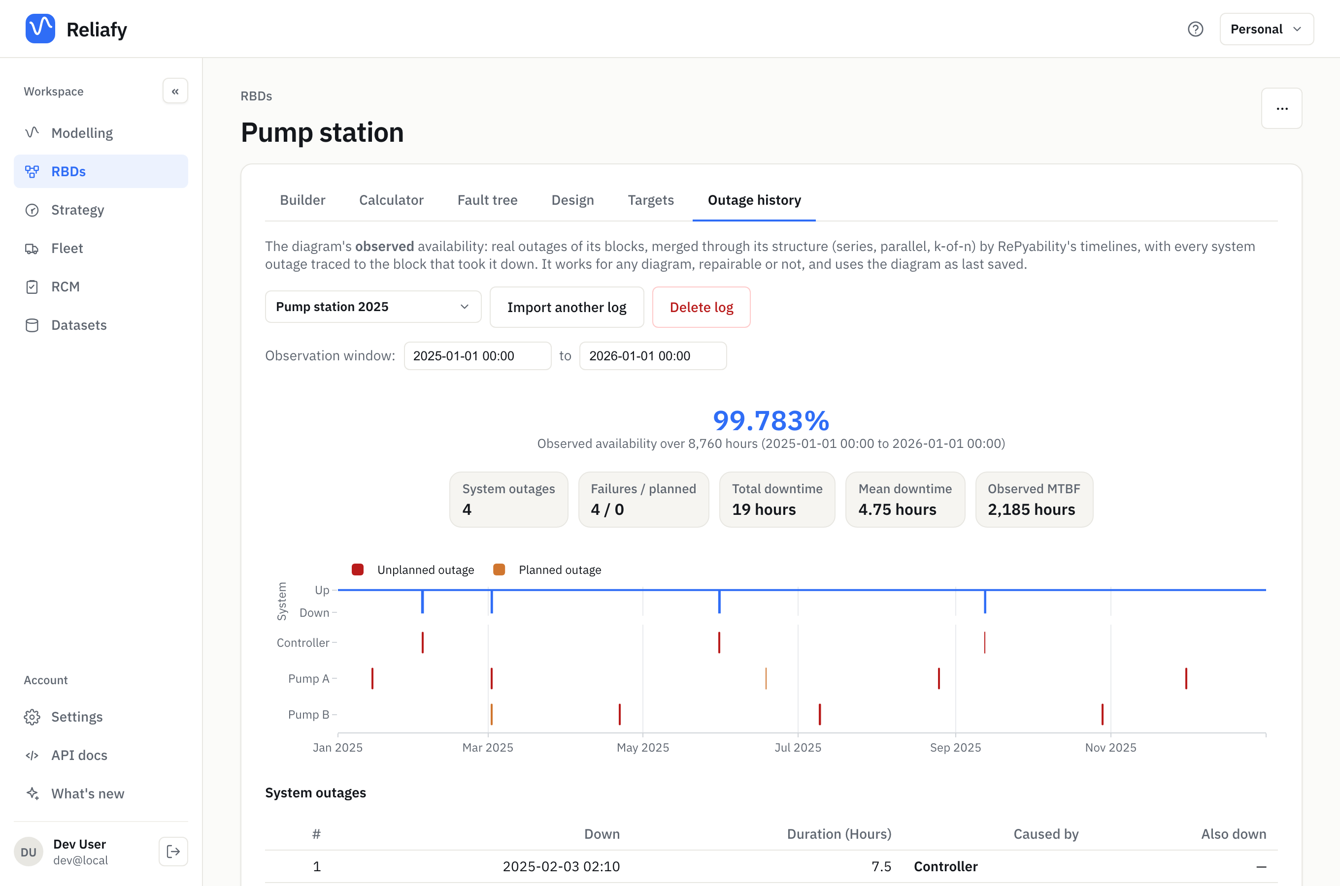
This example is a pump station: a controller in series with two redundant pumps, with a year of outages logged against it.
The headline is the observed availability: here 99.783% over 8,760 hours. Under it:
- System outages: how often the whole system was down (4). The pumps went down nine times between them, but the other pump was nearly always running.
- Failures / planned: of those system outages, how many were failures and how many planned.
- Total downtime and Mean downtime: 19 hours in all, 4.75 hours each.
- Observed MTBF: uptime per system failure, here 2,185 hours.
The timeline shows the system up or down along the top, and each block's outages beneath it: failures in red, planned outages in amber.
System outages lists each one, with Caused by (the block whose outage took the system down) and Also down (blocks that were already down). In the example, on 2 March Pump B was out for planned service when Pump A failed: four hours down, caused by Pump A, with Pump B also down. That's the kind of outage worth spotting, because better scheduling avoids it.
What drove the downtime ranks the blocks by their share of system downtime, with each block's own outages, downtime and availability. Here the controller caused 78.9% of the downtime from three short outages, while each pump was down for about 45 hours on its own and caused far less. Redundancy at work: a block's own downtime isn't what matters, its share of the system's is.
To look at part of the log, change the Observation window dates above the headline. The figures are worked out again for the new window.
Compare it with the model
The diagram's Calculator gives what the model predicts. For the example, the blocks' typed-in estimates predict a long-run availability of 99.39%, about 53 hours down a year. The log says 99.78%, 19 hours. The model was too pessimistic, mostly about the controller.
Life and repair models from this log, at the bottom of the tab, closes the loop. Press Fit models from the log. Reliafy fits a Weibull to each block's times between failures and a lognormal to its repair times:
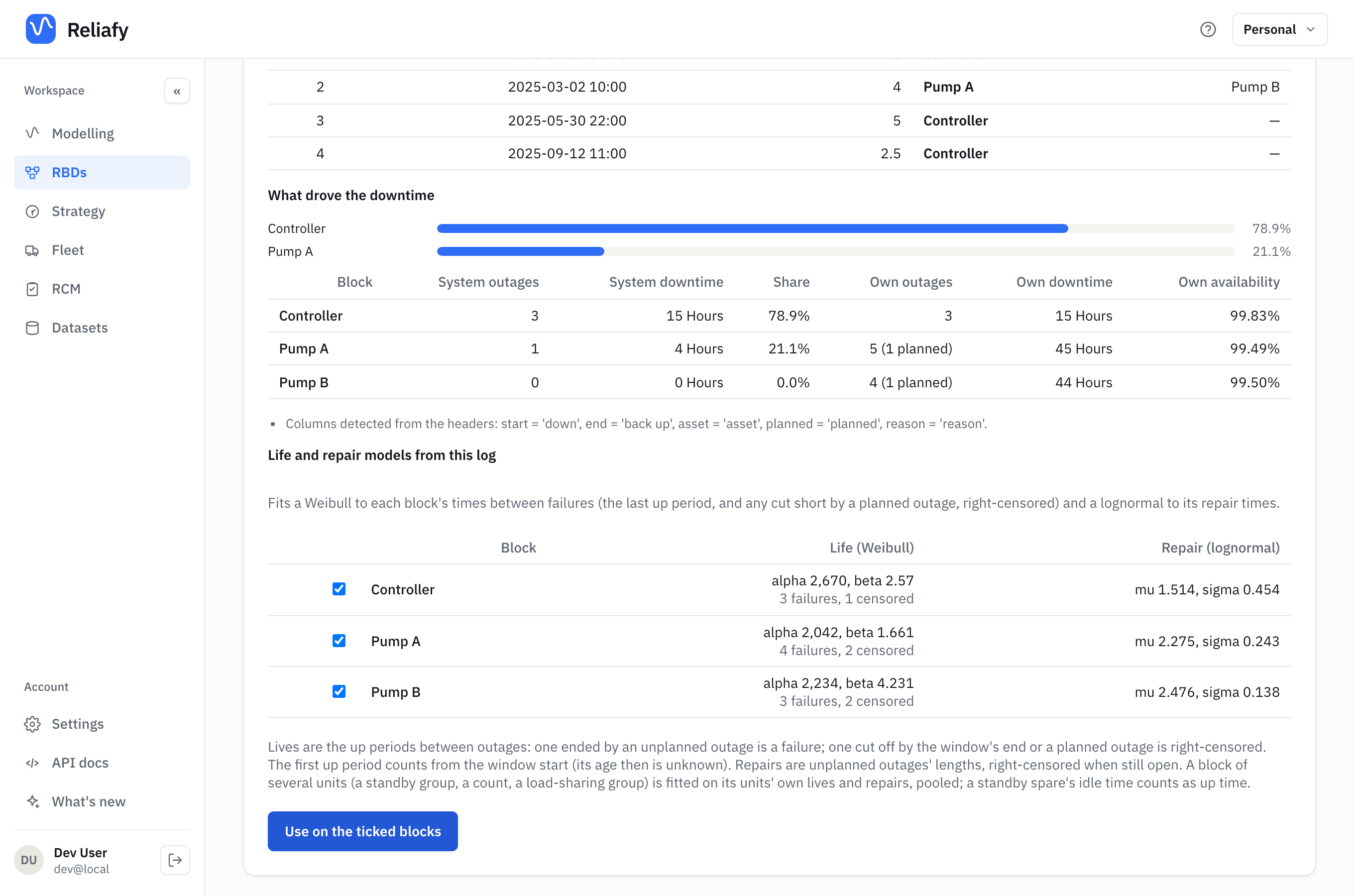
The times between failures are life data like any other. An up period ended by a failure counts as a failure. One cut short by a planned outage, or by the end of the window, counts as still running (right-censored), because the block hadn't failed yet. The controller's fit, α = 2,670 hours with repairs around 4.5 hours, explains the better record: it lasts longer and is fixed faster than the estimate in the diagram.
Tick the blocks whose models you want and press Use on the ticked blocks. The models go onto those blocks in the builder. Save the diagram to keep them, then calculate again.
Be honest about how much a log can say. A year with three or four failures per block gives wide uncertainty in each fit. Treat the fitted models as a check on your estimates, and a better starting point, rather than the final word. Add more logs as they come in: Import another log keeps them side by side, and the menu beside it switches between them.
Outage logs are private to the diagram's owner (and team). They aren't shown to people you share the diagram with or on a public link.
Simulation runs
A different kind of history: every availability simulation you run on a repairable diagram is recorded. On the Calculator tab, open Details after a simulation and follow Run history. The Simulation runs page lists them, newest first, with the availability over the window, the method, the runtime and who ran each one, from the app or a connected AI agent.
- Open a run to see its full result and inputs. Re-run repeats it on the diagram as it was then, and ⋯ downloads it as CSV or JSON. If the diagram has changed since, the run says so.
- Tick two or more finished runs and press Compare to see their availability side by side, on one chart, with whether their intervals overlap. It's the quick way to show what a design change did.
The page says how long runs are kept on your plan.
Where to go next
If the observed availability falls short, the diagram's What to improve ranks the changes that would gain most; see modelling system availability. The fitted lives work like any other life data: for the theory of censored times between failures, see censored data.
The same history is open to scripts and agents: the rbd tool's
upload_outage_log action and rbd_analysis system_history over
MCP.