Find out whether a change made a difference
Before you start: A dataset with a time column and a column that says which group each unit is in (supplier, site, design revision). A status column if some units are still running.
You changed something: a new seal supplier, a redesigned impeller, a different maintenance procedure at one site. Now you want to know whether it worked. Two groups of failure times almost never look identical, so the real question is whether the gap is bigger than chance would give you.
Reliafy answers that three ways:
- Compare groups splits one dataset by a column and compares the groups directly, without fitting a distribution.
- Compare two models puts two items head to head, each as a saved model or as raw data.
- Test planning → Comparison tells you, before you start, how much running time or how many units it takes to see a change of a given size.
Compare the groups in a dataset
Open the dataset under Modelling → Data and press Compare groups at the top of the page. The panel on the right asks for:
- Time column: the time to failure or removal.
- Split by: the column that names each unit's group.
- Censor column (optional): which units failed and which are still running. Tick 1 = failed here (invert it) if your file uses 1 for a failure. With no censor column, every row counts as a failure, unless you choose a failure-mode column.
- Failure mode (optional): to test each mode separately as well (see below). With no censor column, a row with a blank mode is a unit still running, just as when you fit a competing-risks model.
- Unit, and an optional Window (more on that shortly).
Press Compare. The sample Valve seal life vs. temperature & load split by
load gives:
load 0.5 lasts longer: log-rank p = 0.02; on average 306 hours more over the first 1,560 hours (95% CI 53.6 to 557 hours).
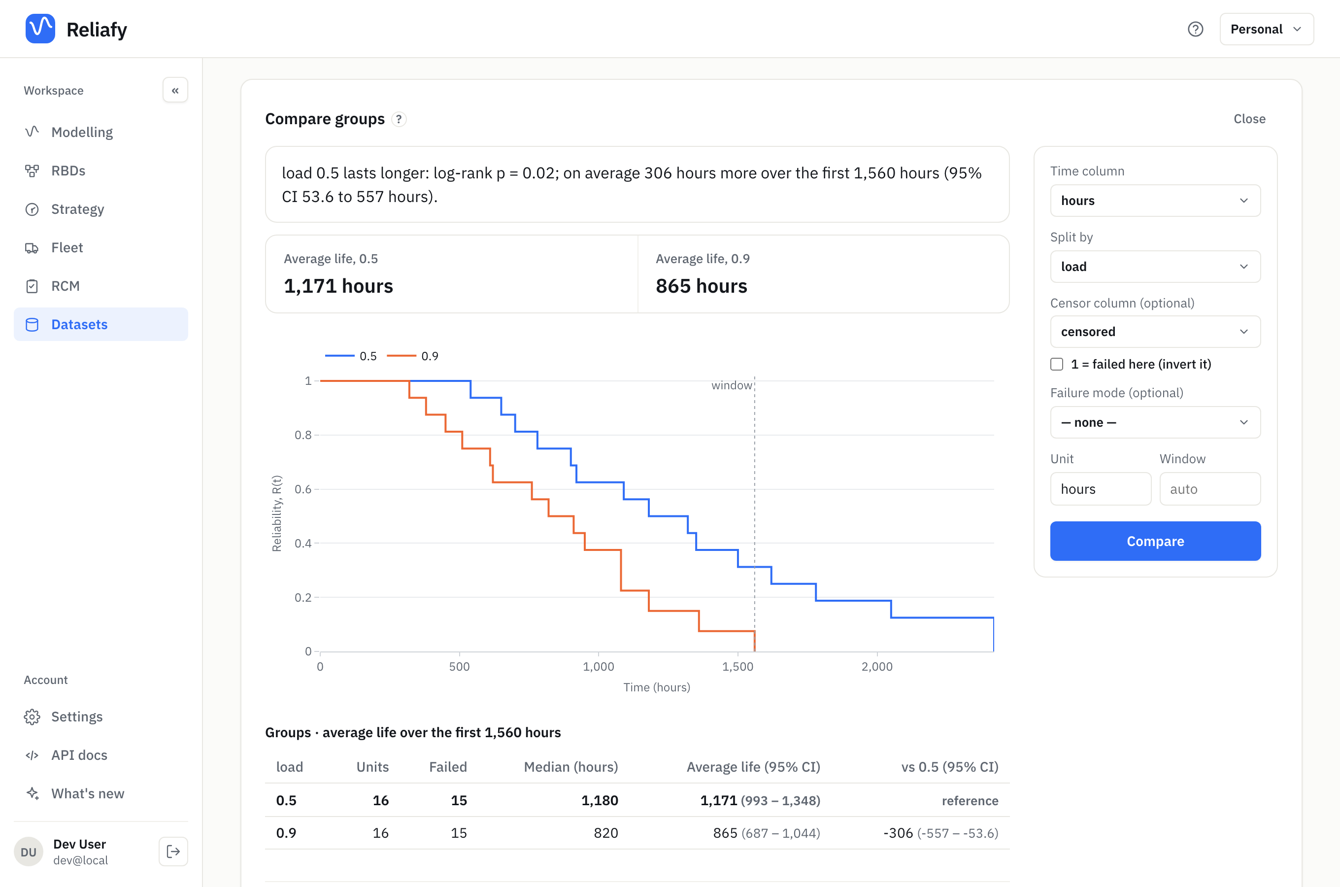
Nothing is fitted here. Each group gets its own Kaplan–Meier curve, the step curve of the fraction still running at each time, worked out straight from the data. Units still running count up to the time they were last seen. That makes the comparison safe even when no distribution fits the data well.
Read the answer
The sentence at the top gives two answers: whether the groups really differ, and by how much.
Is the difference real? That's the log-rank test. It asks: if both groups had the same life, how often would chance alone give a gap this big? That chance is the p-value. Below 0.05, the difference is unlikely to be luck. Here p = 0.02, so the seals at the lower load really do last longer.
By how much? That's the average life over the window, also called the restricted mean survival time (RMST). It is the area under each group's curve up to the window, the dotted line on the chart. In plain words: over the first 1,560 hours, a seal at load 0.5 runs 1,171 hours on average and one at load 0.9 runs 865 hours. The difference is 306 hours, with a 95% interval of 54 to 557 hours. An interval that doesn't cross zero agrees with the test.
The window is needed because a curve that never reaches zero has no finite area. By default it is the latest time every group was still being watched. Type a Window to ask about a period that matters to you, such as a warranty or an overhaul interval.
The table lists each group's units, failures, median life and average life with its interval. With three or more groups, the last column's vs chooser picks the group every other group is measured against.
When the curves cross
Open Tests of the difference for the full set of tests:
- Log-rank ★ weights every failure equally. It's the standard test.
- Gehan–Wilcoxon weights early failures more.
- Tarone–Ware sits in between.
If the tests disagree, look at the chart. Curves that cross mean one group is better early and the other later: a new design that cures infant mortality but wears out sooner, for example. The log-rank test can miss that, because the two halves cancel out. Trust the plot and the average-life difference over the p-value then.
By failure mode
Choose a Failure mode column and the details add Gray's test for each mode: does the groups' chance of failing from that mode differ, with the other modes still acting? A new supplier might cure seal leaks without touching bearing wear, and the all-cause test can hide that. The competing risks guide covers failure modes in full.
A blank mode means the unit is still running, so it counts as censored in the curves and tests too, as it does in a competing-risks fit. With a censor column as well, a unit marked still running has no mode, whatever the column says, and a failure with no mode is an error to fix in the data.
Make it a fair comparison
The test assumes the groups are alike apart from the split. If the new supplier's parts all went to the hottest site, the comparison measures the site as much as the supplier. When something else differs between the groups, fit a model with both as covariates instead: see fit a model with covariates.
Each row must be one unit. A dataset with several rows per unit (a repair history, or repeated measurements) isn't offered for comparison, because it would count one unit many times. Fit a recurrent-event model to a repair history instead.
Compare two items
Strategy → Compare two models puts Item A against Item B. Each side is either a Model (a saved life model, or one you enter) or Data (non-parametric), a CSV of times with an optional censor column. Name each side, set the Unit, and press Compare.
The answer says which item is more reliable across the range, or where the curves cross and which leads on each side of the crossing. It shows both medians, both reliability curves, and under Details the B10 life, median and MTTF of each. When both sides are data, the log-rank test says whether the difference is significant. Press Save to keep the comparison under Strategy.
Use it when the two groups live in different files, or when one side is a vendor's published model and the other is your own field data.
Plan a comparison before you start
The worst time to find out a trial was too small is at the end of it. Strategy → Test planning → Comparison works out how much evidence you need before judging a change. Choose the kind of comparison:
Before and after a change (one fleet). The same fleet's failure rate before the change against after it. Enter Failures before the change, Operating time before, and the Drop in failure rate to detect (%). Then choose what to solve for:
- Operating time needed: how long to run after the change. With 40 failures in 100,000 hours before, seeing a 50% drop with 80% power at 95% confidence takes about 159,300 hours of operation after it.
- Smallest detectable change: the smallest drop a given running time would reliably show.
- Chance of detecting: the power of a plan you already have.
Operating time is the fleet's total: ten units for 100 hours is 1,000 hours.
Old and new side by side (two groups). Old and new units running over the same period, judged by the log-rank test. Enter the Drop in failure rate to detect (%) and the Share of units failing during the study (%). To see a failure rate 40% lower with 80% power at 95% confidence, you need about 121 failures: 121 new and 121 old units if half of them fail during the study.
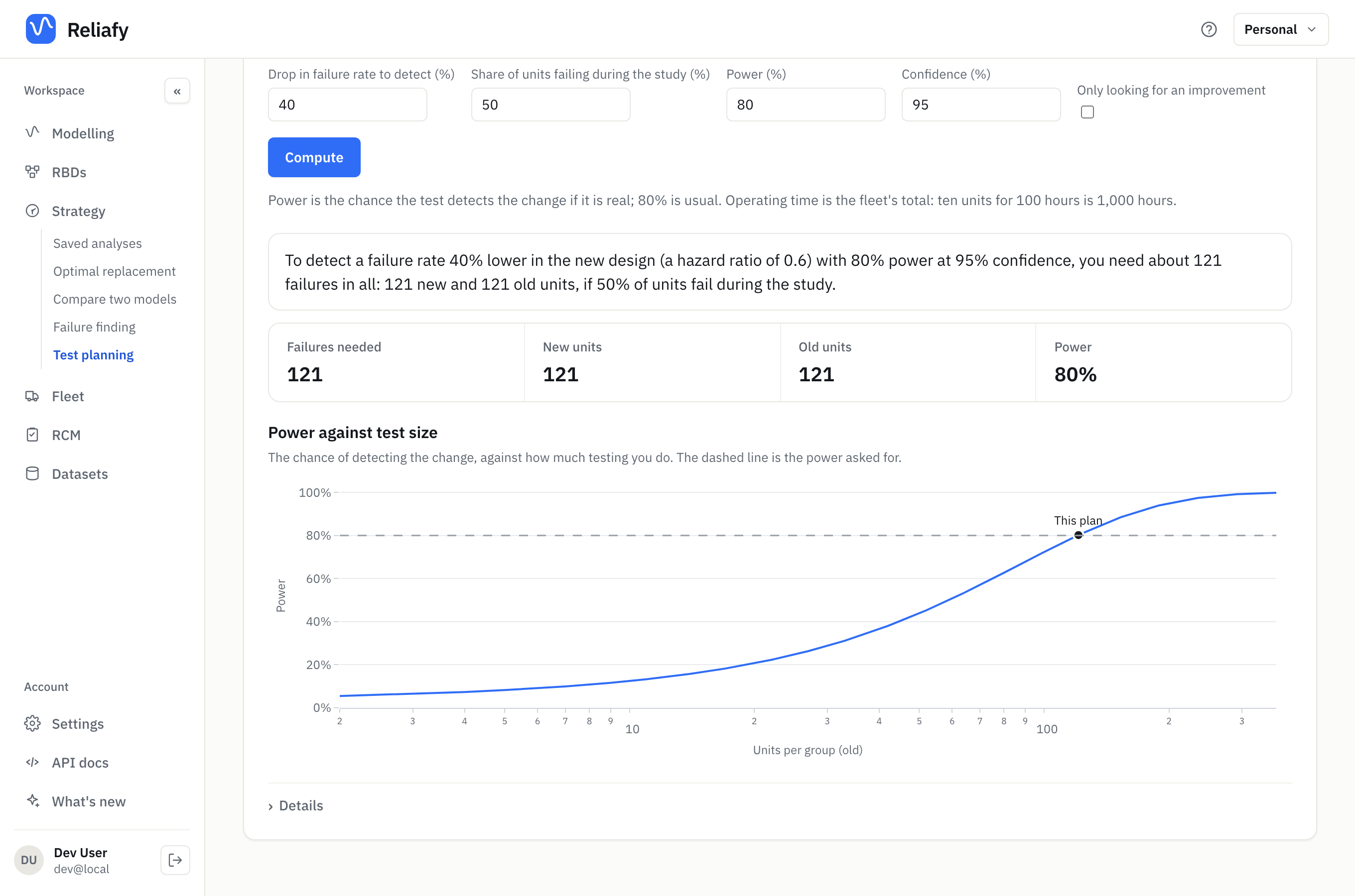
Power is the chance the test detects the change if it is real; 80% is the usual choice. Tick Only looking for an improvement when a change for the worse wouldn't alter what you do. A one-sided test needs a little less data.
The chart shows how the power (or the detectable change) grows with the size of the test, so you can see what doubling the trial would buy. Details lists what the plan takes for granted, such as a steady failure rate before and after the change.
Where to go next
- To model failure modes on their own, see competing risks.
- To measure how much a factor such as load or temperature changes life, rather than just whether two groups differ, see fit a model with covariates.
- To show a requirement is met, rather than compare two designs, see check a requirement and plan a test.
The non-parametric estimators and tests come from SurPyval, an open-source Python library.