Fit your first life model from a CSV
Before you start: A CSV with a column of failure times. Censored units are welcome but not required.
Everything else in Reliafy is built on a fitted life model, so this is the place to start. The input is modest: a column of numbers saying how long things lasted. The output is a distribution you can ask questions of — what fraction survive to 5,000 hours, when will 10% have failed, what's the mean life, and is this thing wearing out or failing randomly.
What your data needs to look like
One row per unit, and a column of times. That's the minimum:
hours
312
420
506
The units can be anything — hours, cycles, kilometres, months — as long as you're consistent. What matters far more is the second column most real datasets need: censoring.
A censored unit is one that hasn't failed yet. If you pulled 30 pumps from
service and 18 had failed while 12 were still running fine when you stopped
looking, those 12 are not "failures at the time I stopped looking" — they're
units that survived at least that long. Throwing them away, or worse, treating
them as failures, will make your equipment look considerably worse than it is.
Reliafy handles them properly if you tell it which is which. Any two codes will
do (you say which means what when you map the columns), but the convention is
0 for a failure and 1 for a still-running unit:
hours,censored
312,0
420,0
2000,1
If you have interval data (the unit failed somewhere between two inspections), or counts, or truncation, those are supported too — but exact times plus censoring covers most real cases.
Loading it in
Reliafy opens on Home: what changed, what needs attention and your recent work, with Start here cards while your workspace is new. From there, go to Modelling → Life models and press New model, then choose Upload a CSV or Excel file (or Paste values). The fit runs in four steps, shown along the bottom: Source, Data, Model and Result. For the source, drop a CSV or Excel file straight onto the page, paste a column of values, or pick a dataset you've already uploaded — datasets are reusable, so once a file is in Reliafy you can fit as many models to it as you like without re-uploading.
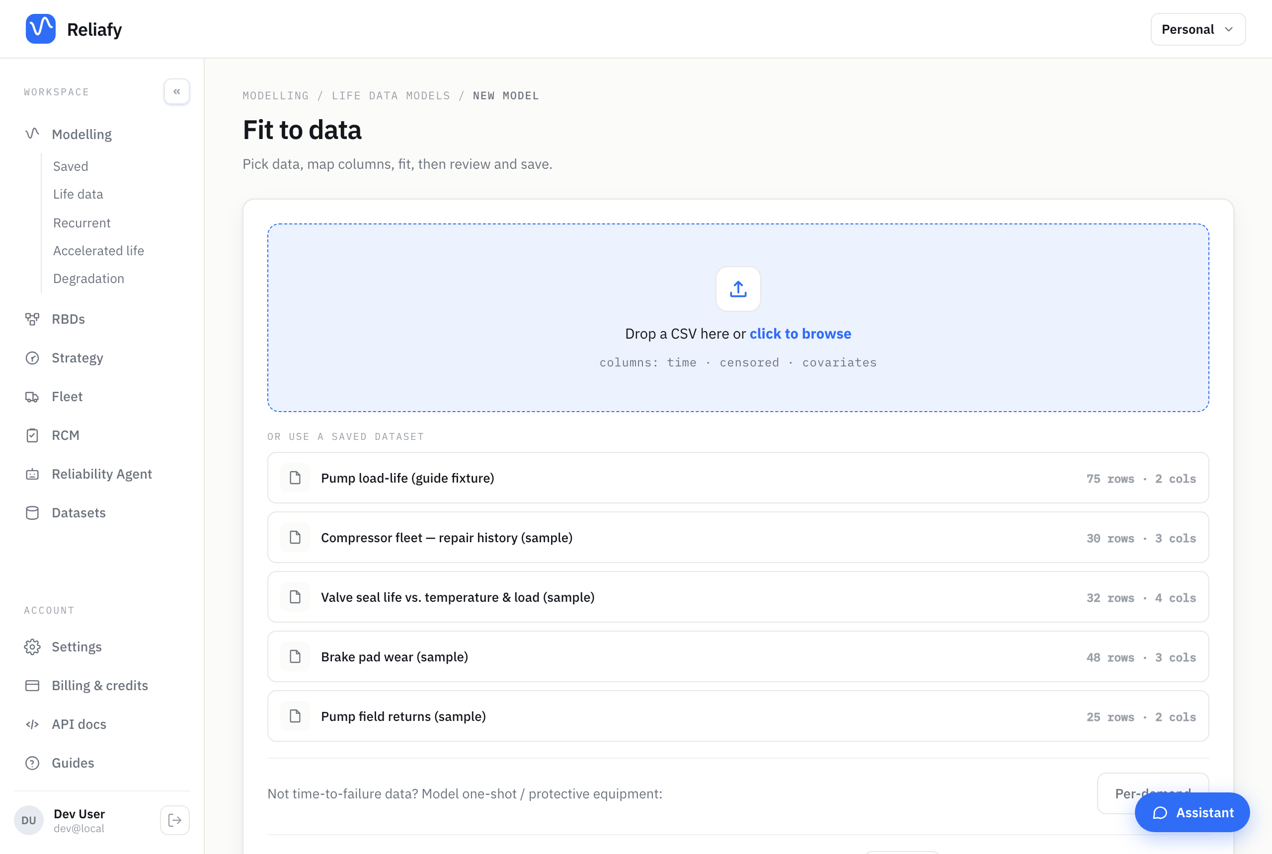
If your file has no header row, upload it under Modelling › Data → New dataset and
tick No header row: Reliafy names the columns col 1, col 2, … so the
first row stays data rather than being eaten as titles.
Mapping the columns
The Data step shows the first rows and asks what each column means, in plain words. You only need the ones your data has:
- Time to failure or removal — the failure or censoring time. Required.
- Failed or still running? — the censoring column. Reliafy lists the values
it finds, with how many rows have each, and you mark each one Failed or
Still running. For the sample Pump field returns,
0is 18 failures and1is 7 pumps still running. - Count — if one row represents several identical units.
- Failure mode — when units fail in more than one way: each mode is treated as a competing risk (see competing risks).
- Under Advanced: interval and truncated data, the earliest and latest possible failure time (for failures found at an inspection, used instead of a single time) and when each unit was observed from and until (truncation).
- Under Advanced (regression): covariates, the columns a failure depends on, such as load or temperature.
Set the Unit here too. It's guessed from the column name where it can be, and it flows through to every chart and result afterwards, so it stops you comparing a model in hours against one in cycles later on.
Choosing a distribution
Then, in the Model step, pick the model. Weibull is the default. If you don't know which distribution you want — and often you genuinely don't — choose Best fit (auto) and Reliafy will fit every candidate and keep the one with the lowest AIC, showing you the full ranking so you can see how close the runners-up were.
If you do want to choose: Weibull is the workhorse and handles wear-out, infant mortality and random failure through its shape parameter. Exponential assumes a constant failure rate — simple, and right more rarely than people assume. Lognormal suits repair times and fatigue. There's also a full set of discrete distributions for cycles-to-failure data, non-parametric estimators (Kaplan-Meier and friends) when you don't want to assume a shape at all, and regression models when failure depends on covariates like temperature or load.
Reading the fit
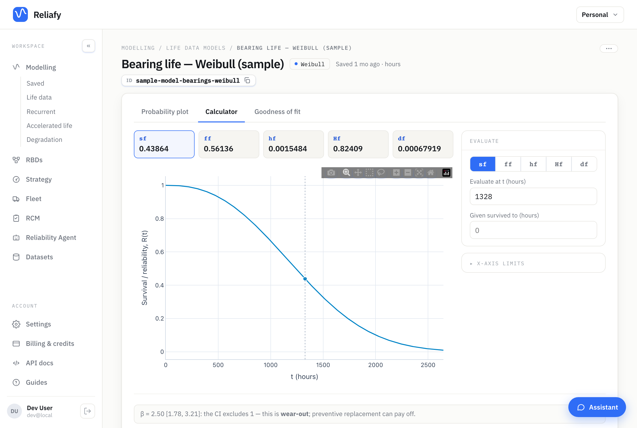
The result has two tabs, Probability plot and Calculator, with a panel beside the plot:
- Parameters — each fitted parameter with its 95% interval, the number of observations, and Fit statistics (the AIC, which opens the log-likelihood, AIC, AICc and BIC, and a comparison with every other distribution).
- Life — the B1, B5, B10 and B50 lives and the mean life (MTTF), each with its lower confidence bound, and a Requirement row to check a B-life requirement against them.
- A short verdict on what the fit means: for a Weibull, wear-out, early-life failures or random failures, judged on β's interval.
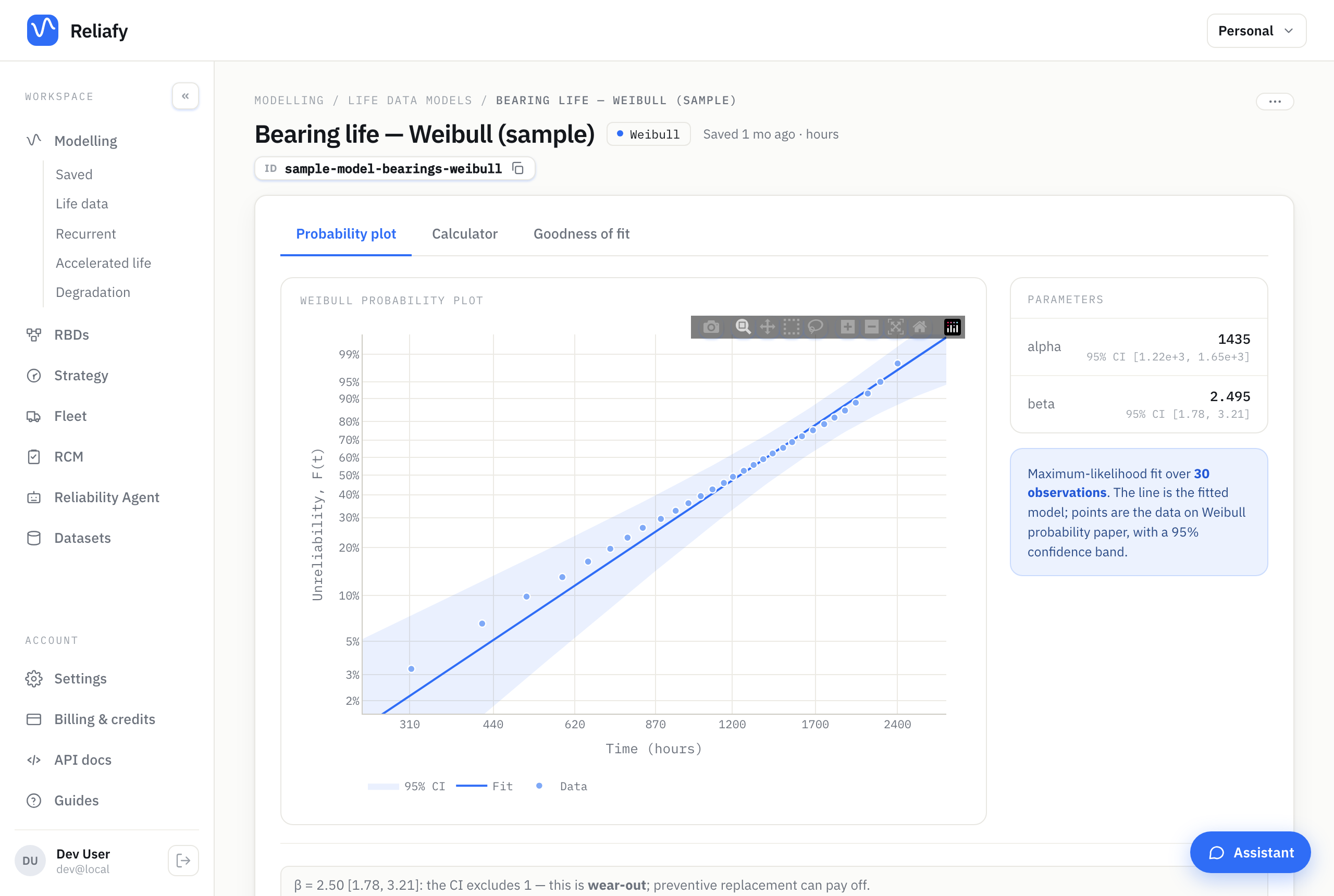
The probability plot is the one to look at first. It puts your data on paper where a good fit is a straight line. If the points track the line, the distribution is a reasonable description of your data. If they curve away systematically, or fall into two distinct groups, that's telling you something real — often that you have two failure modes mixed together and would be better off splitting the data.
For the sample bearing model, 30 failures fit a Weibull with shape β = 2.50 (95% 1.88–3.32) and scale α = 1,440 hours. For a Weibull fit, β is the number worth understanding:
- β < 1 — failures are decreasing over time. Infant mortality: bad installs, manufacturing defects, teething problems. Replacing on a schedule makes things worse, because new units are the risky ones.
- β ≈ 1 — a constant failure rate. Failures are random, age tells you nothing, and scheduled replacement buys you nothing either.
- β > 1 — wear-out. Risk rises with age, and preventive replacement starts to make sense.
That single parameter often changes the maintenance decision more than anything else on the page, which is why the verdict card spells it out. The bearings' whole interval sits above 1, so the card reads Wear-out: β is above 1 at 95% confidence.
The Calculator tab lets you ask the model direct questions: reliability (or any other function) at a given time, or the time by which a given fraction will have failed — each with a confidence bound, stated in words. The B-lives and confidence bounds guide reads them in detail.
Where to go next
Press Save model and it becomes available everywhere else: as a block in a reliability block diagram, as the input to an optimal replacement interval, as the basis of a fleet failure forecast, and as the evidence for a requirement or a demonstration test.
For the theory behind the fit — how censoring is handled in the likelihood, what the parameters mean, and how to read the plots — see the Learn article on Weibull analysis.
The fitting is done by SurPyval, an open-source Python library; its parametric modelling docs show the same fit in code.